If something has gone wrong with your main call-to-action, a download, or other elements of your email, in some cases it may be prudent to send an apology email.
Sometimes this kind of messaging (when used appropriately) actually achieves higher open and click rates than the original message did!

Why We Like It
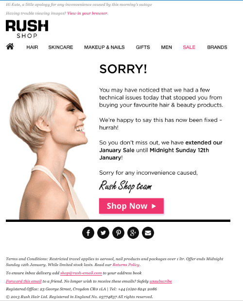
Here Rush clearly state that there was a problem with one of their communications and that the issue has now been fixed.
They also go one step further and extend their sale to allow any subscribers who wanted to purchase and couldn’t due to the error, the chance to take advantage of the offers. This also allows users who didn’t open the original email, but were curious enough to open this message, the chance to purchase as well.
In terms of the general template use, Rush follow best practices by including social media connection buttons, a whitelisting request, pre-header, view online link, clear branding, navigation menu and unsubscribe link.
What Could Be Better
Rush could offer a ‘view on mobile’ link alongside their ‘view in browser’ link to cater for recipients opening the email on a mobile device and having problems viewing the creative.
Although a one column layout is being used for this template which works reasonably well for engagement on mobile devices, Rush may want to consider using a responsive design template in the future; 20-70% of recipients are now opening and interacting with email marketing communications on their mobile devices.
The main message is all image based and could easily have been separated out into text and image parts to allow the main message to still be delivered even with images blocked.
To help decrease complaints, Rush could consider adding an unsubscribe link in the preview pane area of their creative.
The imagery reflects their brand, however the smiling face, does not fit well with the apology message. Rush could have considered using an animated image here, alternating between a sad face and a happy face to reflect the fix of the problem.
Related articles
 Email Marketing Quality Control Lessons from Publishing and Software Engineering
 The best time to send your email newsletter – New year, New Newsletter
 Cart Abandonment Email Insights from Cyber Monday
 10 Benefits of using email marketing for small businesses


