Imagine this……
You spend time, money and effort driving traffic to your website.
But the majority of people who come onto your website may not be ready to purchase. Without gaining an opt in, these prospects will simply leave your website and possibly never return.
Email marketing is the backbone of your company and underpins every other type of marketing you do.
Having a prominent email opt in on your website is a great way to capture information from those visitors that are ready to buy from you, but also (and most importantly) from those that would otherwise have left your website without purchasing anything.
If this happens, these people are lost opportunities at that point, but if you craft a well presented, compelling email opt in form, you may well be able to capture their interest to hear more about you, or act on an opt in offer. You then have their contact details and can work towards providing further valuable information, and lead towards a conversion.
But growing your list is also much more than just capturing those visiting and leaving your website. It needs to be a consistent long term effort across every touch point prospects have with you and your business.
Whether it’s a sign up form on your website or a dedicated squeeze page to capture leads, let’s take a look at 6 key steps to creating a top notch opt in form:
- Create a killer headline
As with a newspaper headline, your objective here is to create a compelling headline that is either BENEFIT driven (by this I mean it focuses on the benefits the subscriber will receive) or hits on a specific problem or wish that the subscriber’s you would like to attract have. It should be kept short and sweet whilst grabbing the attention of the user.
The examples below show the difference between these two headlines:
Speaking directly to your target audience: Benefit driven:

- Be open, honest and transparent
This form is the first impression of your business for many users, so it’s really important to start the relationship off in the right way and tell people exactly what they will receive and when, so that there are no nasty surprises when they start to receive your emails!
By setting their expectations properly at the point of sign up, you will ensure that the people who register really want to receive your communications and are interested in what you offer. This will also help to ensure a low complaint rate (subscribers pressing the spam/junk button) and higher engagement (opens, clicks, conversions etc.) with your campaigns going forward.
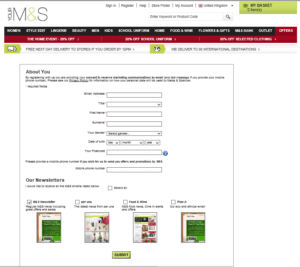
As can be seen in the example from M&S below, showing subscribers an example image / link to an example email that you’ve previously sent, that they can look at helps to illustrate exactly what your communications look like and the value provided.

- Make it easy to use
Ensure your sign up forms are not overly complicated, and are clean, easy to read and understand, as well as to complete. If you can, use systems that make the sign up form more intuitive (such as completing common email addresses, postal addresses from just postcodes etc.), this will also help people to complete the form quickly and easily.
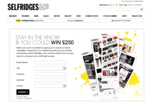
The example below from Selfridges shows a very easy to use, simple sign up form including drop down options, a benefit drive headline and images of previous emails sent to set expectations further.

- Only collect the information you need
It is common marketing knowledge that the more steps you require someone to take to complete an action, the less likely they are to do so. The same holds true when it comes to prospects signing up for your email list – the more information you ask for, the less likely they are to complete the form and sign up.
Collect only the information that you NEED on sign up – so email address, would of course be the minimum level of information needed to register them. However, by asking for items such as first name or what their interests are, you can ensure that you start to personalise your messages from the start of the relationship.
On the flip side, the more fields you require to be completed, although this will reduce the number of sign ups you receive, it is likely that those that do will be even more qualified and interested in what you are offering.
So consider carefully your business objectives, how you will want to personalise your communications going forward to ensure relevancy as well as the end conversion you are driving the sign up to, in order to decide what fields to collect on sign up and which could be collected later on in the relationship (such as during the on-boarding process; the initial sign up automated series of emails).
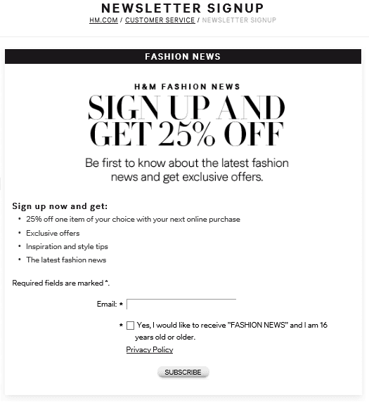
In the example below from H&M they choose to only collect email address on sign up; this may be related to their opt in offer. Giving a discount on sign up means that any subscribers who go on to use this offer will provide more information during the purchase process.

- Give something in return
With so many email programmes out there to choose from, how can you encourage visitors that interact with your website, social media channels, shop front or other touch points, to register to receive YOUR emails?
Sometimes called an opt in offer or lead magnet, adding an incentive gives an additional reason to the user to give you their email address (a valuable commodity) as well as helping to address and bolster the ‘what’s in it for me’ element of the decision to subscribe.
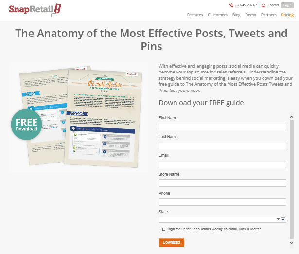
The example below from SnapRetail shows a squeeze page offering a free guide as the incentive.

Want more info about opt in offers? Download my free guide ’28 Incredibly Enticing Opt In Offers to Build Your Email List’ here >
- Put it everywhere and make it prominent!
If no one sees your sign up form, how is your list going to grow?! Ensure you place it, and advertise it, everywhere that you have a touch point with prospects and customers including, first and foremost, your website.
The key here is to capture the traffic you drive to your website through other marketing that you are doing; as I mentioned at the beginning of this post, email marketing underpins every other marketing effort you make.
Want to know more?! Watch this short video >


